
Today my rowing inspiration was from one of my training partners who recently made her workout graphs much more interesting by using a heart strap to add heart rate to her charts.
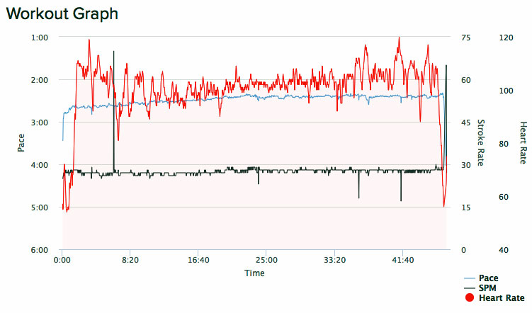
Compared to my heart rate graphs recently, hers are beautiful smooth lines. You can see one of her beautiful HR graphs immediately below this paragraph.
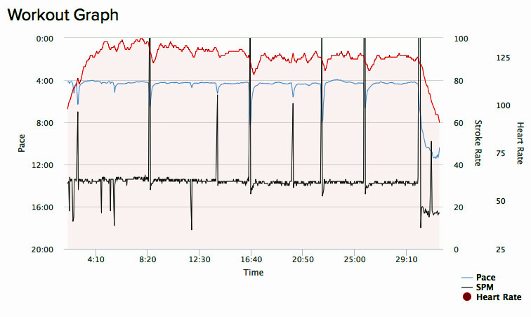
After gazing at her heart graph for a bit and admiring its smooth line I decided to make this morning’s rowing an emulation of sorts, to try to plot a smooth HR graph of my own. To do that I maintained a steady pace with only small adjustments for the sake of keeping HR in the vicinity of just over 100 BPM. You can see the raggedy, jagged and non-beautiful heart rate graph that resulted for my workout chart, immediately below this paragraph.
Any workout sessions for any day can be seen in detail via this: link to the online logbook. To see a session’s data and interactive graph click the “+” sign in “Action” column for that session.
Happy rowing to you!