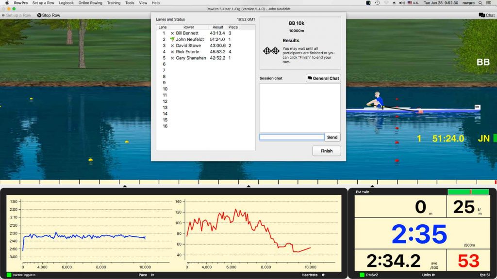
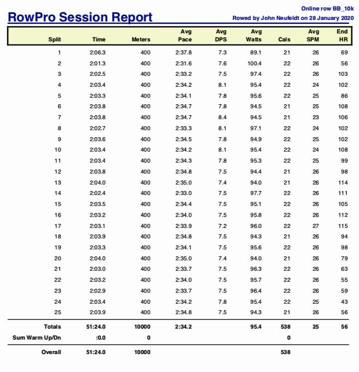
Today’s workout time consisted of an online 10,000 meter rowing session in the morning and an offline 10,000 meter rowing session in the afternoon.
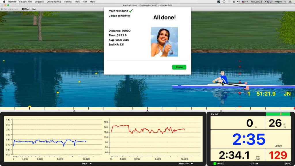
The morning 10K was done at a steady average pace of 2:34.2/500 meters and the afternoon 10K was done at a steady average pace of 2:34.1/500 meters. There was also a 1K rowing warmup and a 1K rowing warmdown in the morning and a 56 Calorie SkiErg warmup in the afternoon. They and their interactive charts and data can all be viewed in at this link: in my online logbook. The only data and screenshots shown here will be for the two 10K rowing sessions.
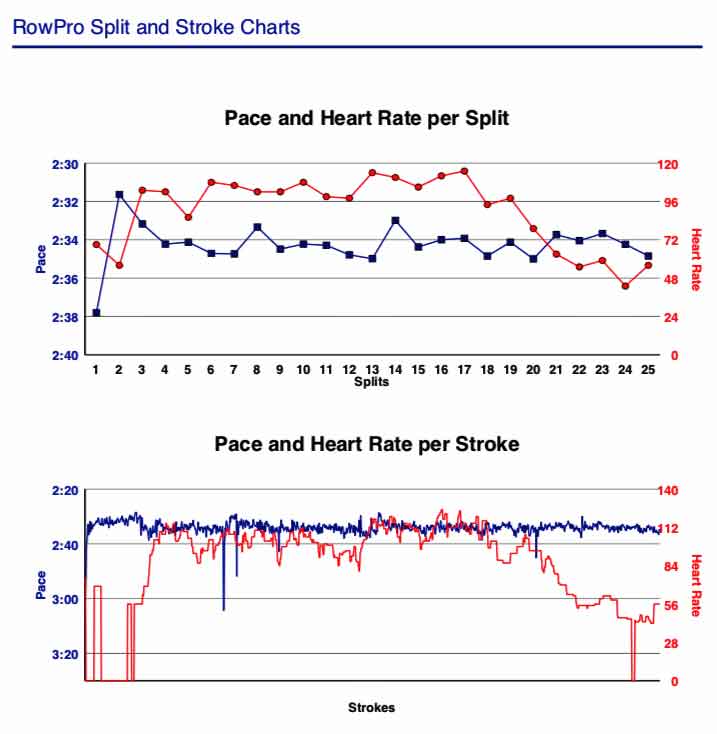
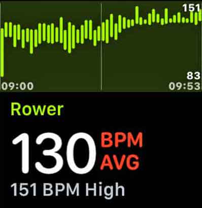
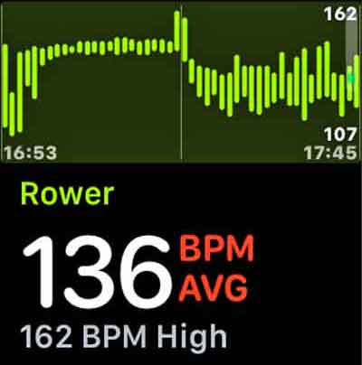
The heart behaved in a rather haywire fashion in both of the 10,000 meter rowing sessions.
There were two heart straps used, simultaneously, during each of the two 10,000 meter rowing sessions. A Garmin heart strap was worn on the chest and supplied data for the RowPro graphs. The other graphs used data from a Scosche heart strap worn on the arm. The heartbeat signal appeared to be doing one thing in the chest and something a bit different in the arm.
I was having atrial fibrillation before, during and after each of the 10K rowing sessions.


Happy rowing to you!
