
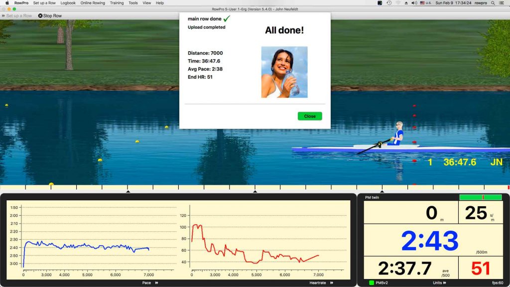
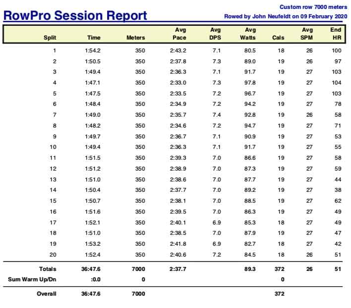
There were a total of seven workout session segments today. None of them were very long. The longest was 7,000 meters while rowing.
You can see all graphs and data for them via this link to my online logbook, looking for log entries that were made on today’s date and clicking their corresponding “+” signs in the Action column.
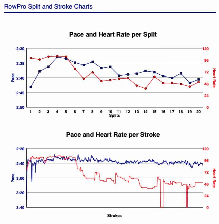
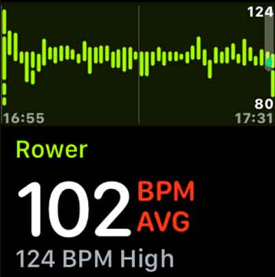
If you look closely at the RowPro-generated HR graph for the 7K, you’ll notice that it’s kinda crazy. Slope of the graph is descending though pace is fairly constant and rate is “impossibly” low for the effort level. It was graphed using data from the Garmin chest heart strap. The green-on-black graph below it looks totally reasonable so it was probably correct. It shows HR in normal range throughout the 7K. It used data from a Scosche optical heart strap. The Scosche is worn on the arm and I call it an “optical” strap because its method of detecting pulse relies on monitoring changes in the amount of reflected light instead of monitoring the body’s electrical current through the heart.
There was no atrial fibrillation just before, during or immediately following today’s rowing; therefore the weird Garmin HR graph was caused by something else. My guess is that it was averaging the strongest periodic pulses recognized by its algorithm and the heart was on the brink of atrial fibrillation, generating pairs of pulses instead of single pulses for each beat whose phase relationship did not remain constant.
Happy rowing to you!